Adding a Border to a SwiftUI Button
— SwiftUI, Button Styles, User Interface — 1 min read
Buttons are an essential part of any user interface, serving as common elements for interaction in applications. In SwiftUI, creating a visually appealing button often involves more than just applying basic styles. It's about adding subtle details that can make a significant difference in the overall aesthetics and user experience. One effective way to enhance the appearance of a button is by adding a border. In this guide, we'll explore how to accomplish this in SwiftUI, complete with examples to illustrate the process.
Getting Started with SwiftUI Buttons
Before diving into the specifics of adding a border to a SwiftUI button, let's briefly review how to create a basic button in SwiftUI.
1import SwiftUI2
3struct ContentView: View {4 var body: some View {5 Button("Tap me!") {6 // Button action7 }8 }9}The above code snippet demonstrates a simple SwiftUI button. When rendered, it will display a default-styled button with no defined border. Now, let's take things up a notch and explore how to add a border to this button.
Adding a Border to a SwiftUI Button
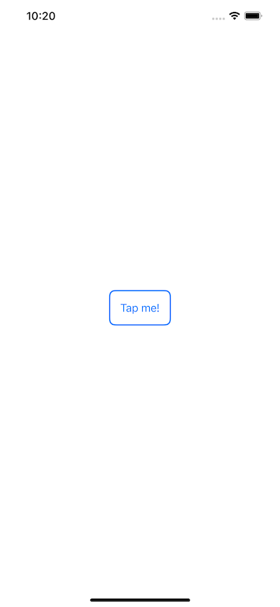
To add a border to a SwiftUI button, we can leverage the overlay modifier along with the RoundedRectangle shape. By combining these elements, we can achieve a custom border effect that enhances the button's appearance.
1struct ContentView: View {2 var body: some View {3 Button(action: {4 // Button action5 }) {6 Text("Tap me!")7 .padding()8 .overlay(9 RoundedRectangle(cornerRadius: 8)10 .stroke(Color.blue, lineWidth: 2)11 )12 }13 }14}In the above modified code snippet, the overlay modifier encapsulates a RoundedRectangle shape styled with a stroke of specified color and line width. This effectively creates a border around the button, providing a visually distinct appearance.

Customizing the Border
Adding a border to a button offers ample room for customization. Let's explore how we can further tailor the border to suit specific design requirements.
Adjusting Border Color and Width
The border's color and width can be easily customized to align with the overall design scheme of the application. For instance, to change the border color to red and increase its width to 3 points, the following modifications can be applied:
1.overlay(2 RoundedRectangle(cornerRadius: 8)3 .stroke(Color.red, lineWidth: 3)4)By modifying the color and width values within the stroke modifier, the border's appearance can be tailored to fit the desired visual style.