TopAppBars in Compose Material 3(Material You)
— Android, Jetpack, Compose, Material3 — 1 min read
I hadn't had a chance to check out Material You yet so I might be a little late to the game here but I wanted to write a quick article about TopAppBar in Compose Material 3.
Today I fired up a new project in Android Studio and realized that there are some new Composables available for the App Bar in Material 3. It looks like TopAppBar has been split into 3 new categories in Compose Material 3: SmallTopAppBar, MediumTopAppBar and LargeTopAppBar - and they all seem to be interchangeable with the standard TopAppBar. You can use the title, actions and navigationIcon parameters in them like you always have - but there does seem to be some subtle changes.
SmallTopAppBar
1@ExperimentalMaterial3Api2@Composable3fun SmallTopAppBar(4 title: @Composable () -> Unit,5 modifier: Modifier = Modifier,6 navigationIcon: @Composable () -> Unit = {},7 actions: @Composable RowScope.() -> Unit = {},8 windowInsets: WindowInsets = TopAppBarDefaults.windowInsets,9 colors: TopAppBarColors = TopAppBarDefaults.smallTopAppBarColors(),10 scrollBehavior: TopAppBarScrollBehavior? = null11) {12 SingleRowTopAppBar(13 modifier = modifier,14 title = title,15 titleTextStyle = MaterialTheme.typography.fromToken(TopAppBarSmallTokens.HeadlineFont),16 centeredTitle = false,17 navigationIcon = navigationIcon,18 actions = actions,19 windowInsets = windowInsets,20 colors = colors,21 scrollBehavior = scrollBehavior22 )23}First off is SmallTopAppBar, appearence wise I think this one is closest to the original TopAppBar out of all three - with some small differences of course. Sizing wise it seems the same too. Here's a quick example of how it looks:

MediumTopAppBar
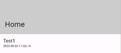
1@ExperimentalMaterial3Api2@Composable3fun MediumTopAppBar(4 title: @Composable () -> Unit,5 modifier: Modifier = Modifier,6 navigationIcon: @Composable () -> Unit = {},7 actions: @Composable RowScope.() -> Unit = {},8 windowInsets: WindowInsets = TopAppBarDefaults.windowInsets,9 colors: TopAppBarColors = TopAppBarDefaults.mediumTopAppBarColors(),10 scrollBehavior: TopAppBarScrollBehavior? = null11) {12 TwoRowsTopAppBar(13 modifier = modifier,14 title = title,15 titleTextStyle = MaterialTheme.typography.fromToken(TopAppBarMediumTokens.HeadlineFont),16 smallTitleTextStyle = MaterialTheme.typography.fromToken(TopAppBarSmallTokens.HeadlineFont),17 titleBottomPadding = MediumTitleBottomPadding,18 smallTitle = title,19 navigationIcon = navigationIcon,20 actions = actions,21 colors = colors,22 windowInsets = windowInsets,23 maxHeight = TopAppBarMediumTokens.ContainerHeight,24 pinnedHeight = TopAppBarSmallTokens.ContainerHeight,25 scrollBehavior = scrollBehavior26 )27}Next is MediumTopAppBar - a slightly longer version of SmallTopAppBar(there's a bit of a pattern here clearly):

LargeTopAppBar
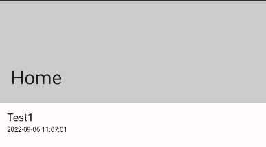
1@ExperimentalMaterial3Api2@Composable3fun LargeTopAppBar(4 title: @Composable () -> Unit,5 modifier: Modifier = Modifier,6 navigationIcon: @Composable () -> Unit = {},7 actions: @Composable RowScope.() -> Unit = {},8 windowInsets: WindowInsets = TopAppBarDefaults.windowInsets,9 colors: TopAppBarColors = TopAppBarDefaults.largeTopAppBarColors(),10 scrollBehavior: TopAppBarScrollBehavior? = null11) {12 TwoRowsTopAppBar(13 title = title,14 titleTextStyle = MaterialTheme.typography.fromToken(TopAppBarLargeTokens.HeadlineFont),15 smallTitleTextStyle = MaterialTheme.typography.fromToken(TopAppBarSmallTokens.HeadlineFont),16 titleBottomPadding = LargeTitleBottomPadding,17 smallTitle = title,18 modifier = modifier,19 navigationIcon = navigationIcon,20 actions = actions,21 colors = colors,22 windowInsets = windowInsets,23 maxHeight = TopAppBarLargeTokens.ContainerHeight,24 pinnedHeight = TopAppBarSmallTokens.ContainerHeight,25 scrollBehavior = scrollBehavior26 )27}Last of the three is LargeTopAppBar - which is even longer than the two versions above. It's pretty huge:

As you can above there is a parameter called scrollBehavior that you can use to define scroll behaviour - for example you can make a LargeTopAppBar shrink when there is scrollable content inside it that has been scrolled. I think I'll write about how you can do this in a separate post sometime.
CenterAlignedTopAppBar
And here's the bonus round - there is also a TopAppBar called CenterAlignedTopAppBar which centers the title. I don't think there was any way to do this with the standard TopAppBar without using workarounds so I'm happy that this has been added in - it's something that has been available in Flutter for a long time now. Here's how it looks:
